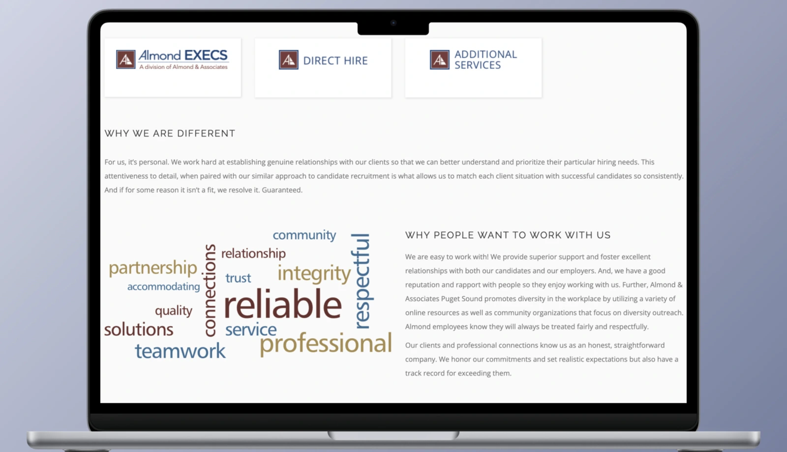
Project goals
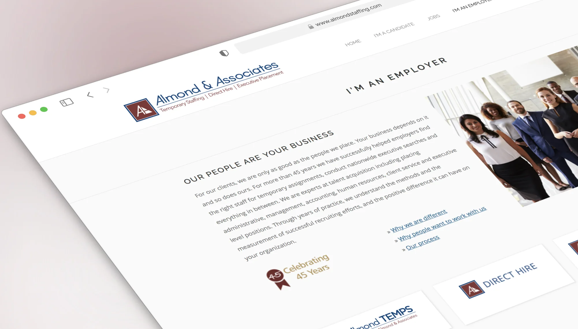
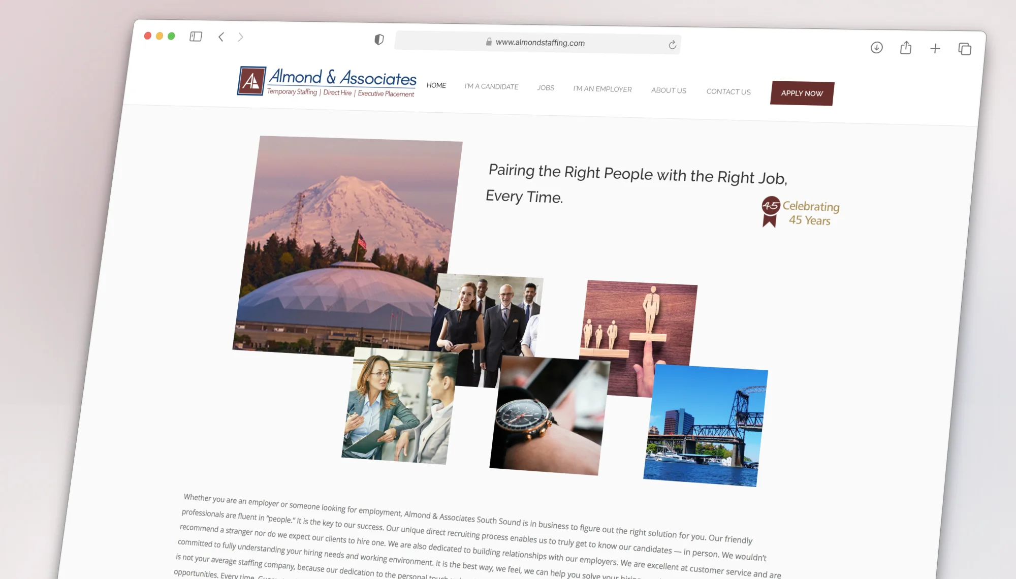
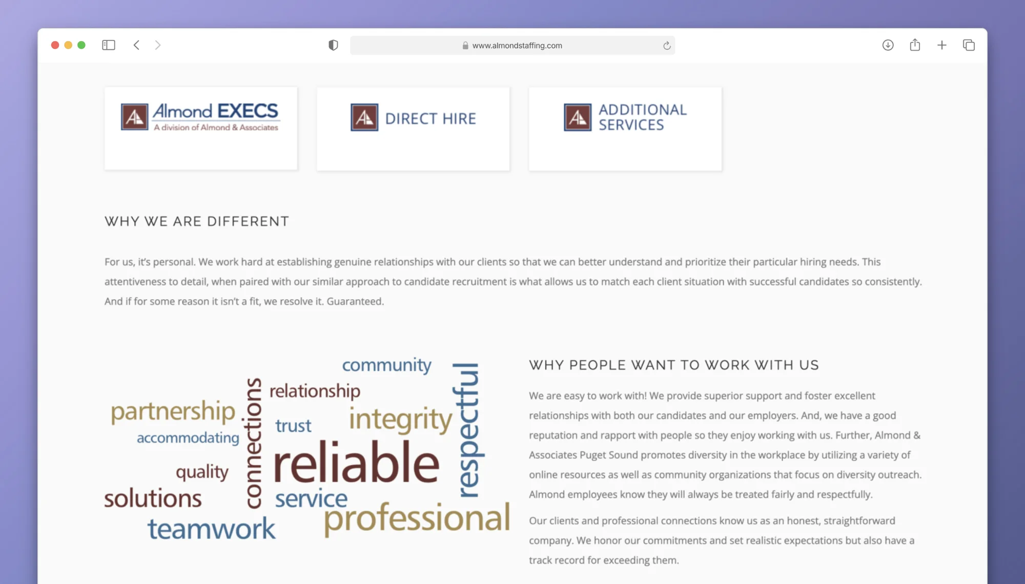
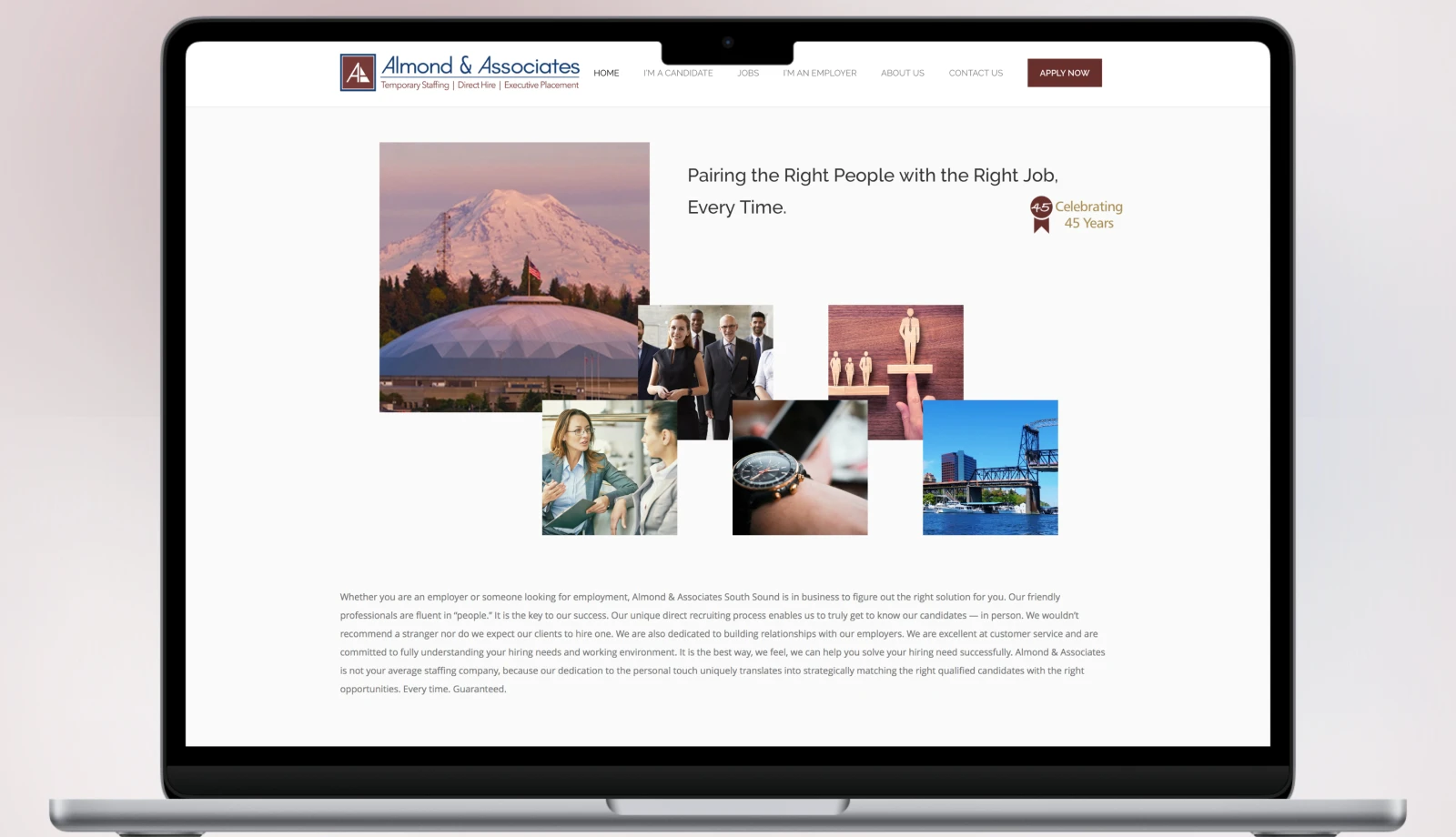
The client needed a complete refresh of online and print marketing materials to be more competitive in attracting new job talent.
Technologies Used
wordpress
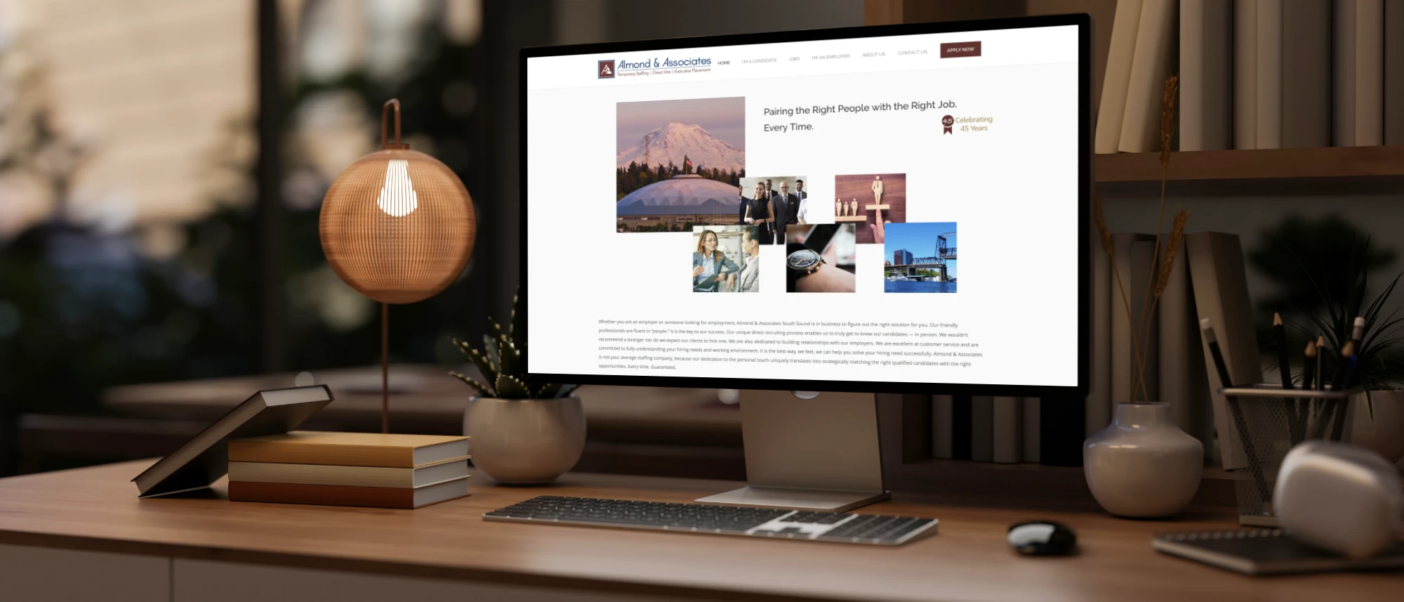
Clean & modern user experience with intentional focus.
Crafting effective designs requires years of experience understanding how to strategically combine creative elements. The thoughtful use of color, light, and typography can evoke fundamental human emotions, elevating website experiences.
Let the experts at On The Brink Designs guide you through this creative process.
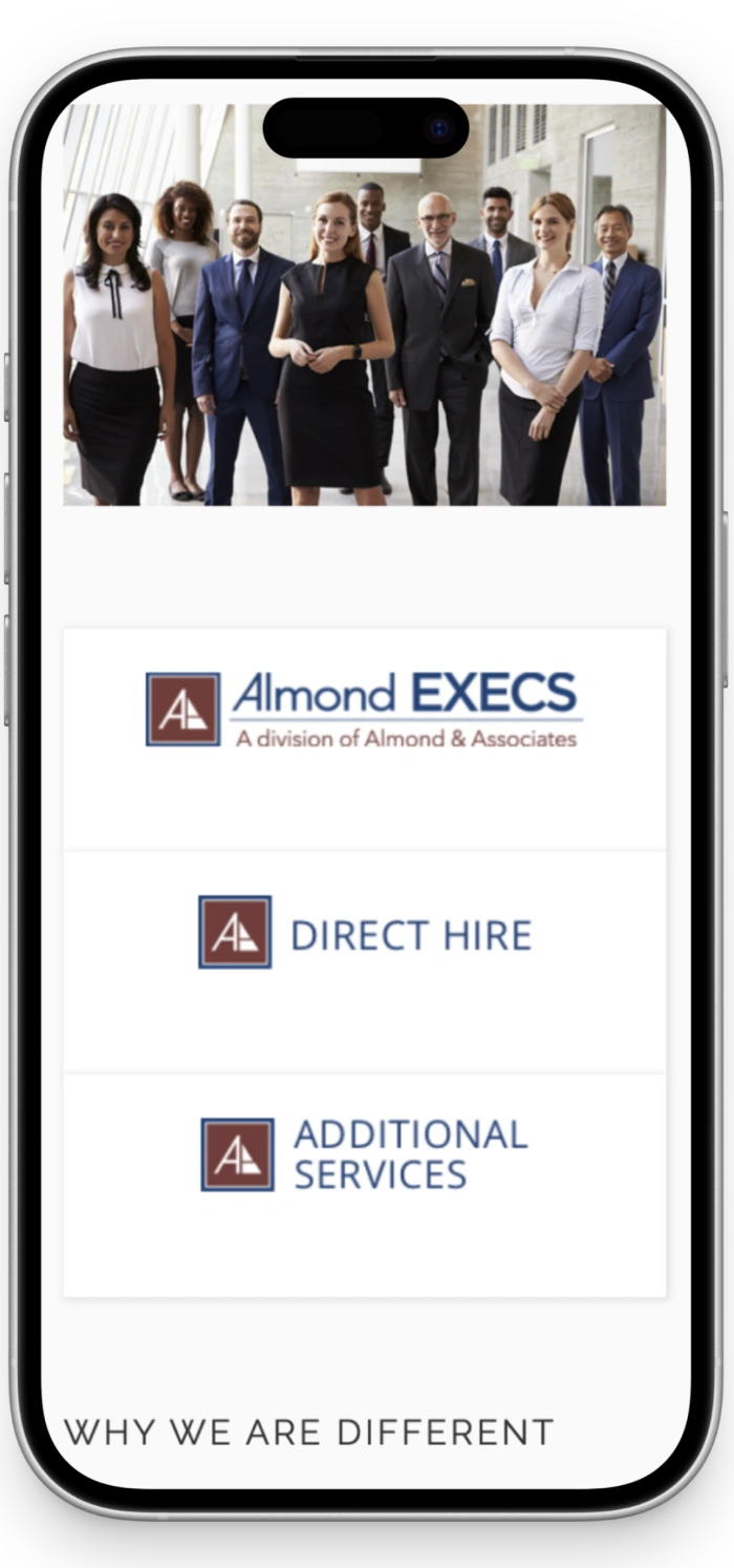
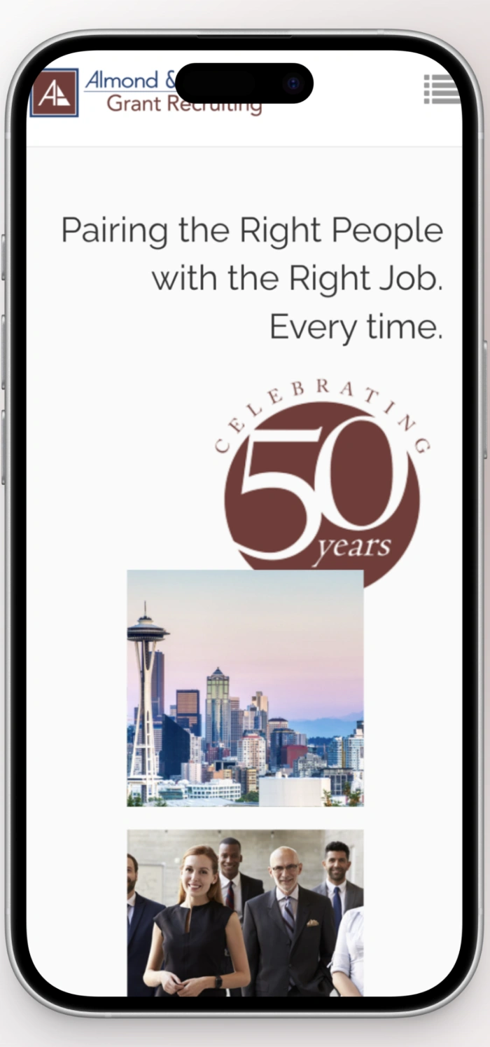
Engaging, mobile-first UX design
Experience the tailored mobile layouts crafted for this project. Each screen is optimized for clarity, readability, and delightful interaction on phones and tablets.

Color palette
Color is not just decoration—it's communication. Every hue in this palette was chosen to evoke emotion, guide attention, and strengthen the brand's visual identity.
Wine
#672F2D
R 103
G 47
B 45
Driftwood
#a68a4d
R 166
G 138
B 77
Denim
#386C93
R 56
G 107
B 147
Typography
Typography creates hierarchy, rhythm, and personality. The typefaces in this project were selected to ensure readability while expressing the brand's unique voice across every touchpoint.
Typeface
Open Sans
Usage
Body
Aà
Clean and readable sans-serif for body text and interface elements, ensuring optimal readability.
AaBbCcDdEe
FfGgHhIiJj
KkLlMmNn
OoPpQqRrS
sTtUuVvWw
XxYyZz
0123456789
Typeface
Raleway
Usage
Headlines
Aà
Bold and impactful typeface for headlines and primary messaging, creating strong visual hierarchy.
AaBbCcDdEe
FfGgHhIiJj
KkLlMmNn
OoPpQqRrS
sTtUuVvWw
XxYyZz
0123456789